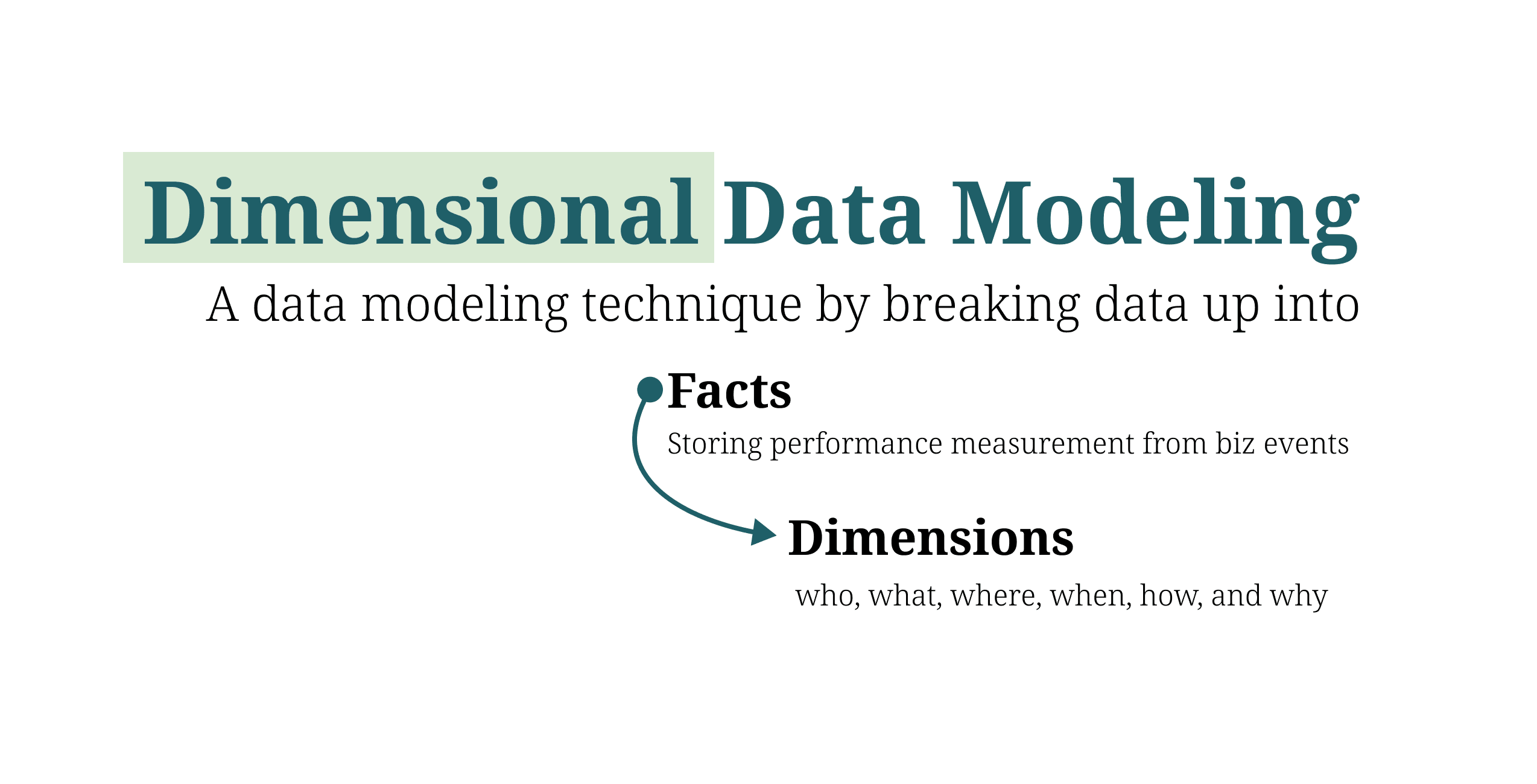
In this article, I will introduce the concept of the Basic Fact table in Dimensional data modeling. To understand this technique, we will explore the different types of data modeling and recap some fundamental knowledge, including the star and snowflake schemas, and the concepts of normalization.