- Published on
Principle of Design in Data Visualization
- Authors

- Name
- Mai Khoi TIEU
- @tieukhoimai

This article represents TALK#6 in the DATACracy series. The content, originally written in Vietnamese, is available on the project's official website.
Data visualization is the visual presentation of data or information. The goal of data visualization is to communicate data or information clearly and effectively to readers. Typically, data is visualized in the form of a chart, infographic, diagram or map. - What is Data Visualization?
However, it's important to note that just making a lot of charts and put them together doesn't mean you're doing GOOD data visualization. So, what makes a visualization truly “good”? Another article points out four key elements: Information, Function, Visual Form, and Story. These components are crucial for achieving a successful and "good" visualization.

From these elements, it becomes evident that the field of data visualization combines both art and science. A data visualization, while creatively pleasing, should also serve a functional purpose in effectively communicating data.
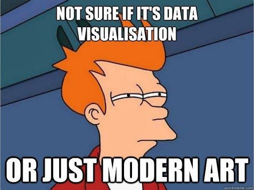
In this context, we can refer to data visualization as a modern art form. Instead of providing step-by-step instructions for enhancing your dashboard, this article will introduce seven design principles as a solid foundation for this “modern art” field.
Table of Contents
Principle 1. Balance

Balance is a critical aspect of effective data visualization, ensuring that every part of the visualization receives equal attention and preventing the viewer's eye from being overly drawn to a specific area. This equilibrium not only creates a sense of visual harmony but also enhances the overall appeal of the visualization.
#1 - Distribute Visual Element evenly
To achieve a well-balanced and visually appealing data visualization, it's imperative to evenly distribute visual elements (charts, graphs, text, and images) across the composition. This involves avoiding the clustering of elements in one area, as it can make the visualization appear cluttered and disorganized.
#2 - Consistent in Design Element
Consistency in common design elements (line weight, font style, or color) plays a pivotal role in achieving balance. By employing uniformity in text size and style for headings, labels, and descriptions. This consistency not only aids in readability but also helps users quickly comprehend the structure of the visualization.

#3 - Using Symmetrical balance or Asymmetrical balance
When discussing balance, our minds often leap to the concept of symmetrical balance, yet this is just one of the four types. In the context of this article, we'll explore two common types: symmetrical and asymmetrical balance.
Symmetrical balance involves elements being reflected along the central axis, instilling a sense of stability and order. This makes it well-suited for visual representations requiring clear, straightforward data presentation.

On the contrary, asymmetrical balance arranges elements unevenly while maintaining an overall sense of equilibrium. This technique introduces visual interest and dynamic tension, proving beneficial when handling diverse datasets or aiming for a more captivating and visually intriguing design.

Principle 2. Emphasis

There are 3 methods of the EMPHASIZE Principle:
- Scale involves adjusting the size of certain visual components to make them stand out. By varying the size of elements, we can draw attention of user to specific aspects within a composition. Larger elements tend to dominate attention, making them key focal points.
- Contrast refers to the deliberate difference between visual elements to create a noticeable distinction. Utilizing differences in visual attributes enhances the visibility of specific elements. High contrast captures attention and emphasizes the importance of highlighted components.
- Proximity emphasizes elements by placing them close to each other, suggesting a connection or relationship. Grouping related elements together through proximity signifies their association. This method aids in guiding the viewer's focus to specific clusters of information, making it easier to interpret and understand the visual hierarchy.

#1 - Adjust Size and Scale
Increasing the size or scale of pivotal elements in your visualization can direct attention to them, underscoring their significance. This enhances visibility and facilitates easy identification for viewers.
#2 - Add Annotations or Callouts
Annotations, callouts, and tooltips aren't mere space-fillers. They serve to highlight data insights or trends. These supplementary elements offer context and explanations for specific data points, contributing to increased accessibility and understanding of the data.

Principle 3. Movement
Movement enhances user guidance through information, facilitating a clearer understanding of relationships between various data points and trends.

#1 - Arrange Elements Sequentially
Organizing elements in a logical order within a data visualization, reflecting the progression of time or the sequence for optimal information consumption, significantly enhances comprehension.
Example: 4-card chart with the sequence View -> Visit -> New Users -> Active Users, each card represents a stage or metric in a user engagement or conversion funnel.
#2 - Repeated Visual Elements Establish a Sense of Rhythm
Employing repetition and rhythm in data visualization enhances overall flow and coherence. It creates a sense of rhythm within the visualization, guiding the viewer's eye through the data. This approach can unveil patterns or trends that might otherwise go unnoticed.

Principle 4. Proportion
Ensuring appropriate proportions and accurate data representation in data visualization. Misrepresenting scale proportions can lead to inaccurate conclusions and diminish the reliability of the data.

#1 - Choose Appropriate Chart Types
Selecting the right chart type is essential for preserving proper proportions and accurately conveying data. For instance:
- Bar charts: Ideal for comparing discrete categories, displaying clear differences in magnitudes between data points.
- Line charts: Better suited for illustrating trends over time, connecting data points chronologically for easy identification of patterns and fluctuations.
#2 - Use Consistent Measurement
- Relative Scales: Helpful for comparing proportions and ratios. For instance, when visualizing regional traffic data, using relative scales allows users to quickly understand the contributions of each region to the market.
- Absolute Scales: Better for presenting exact values. For example, when visualizing traffic by device, an absolute scale conveys precise traffic figures, aiding in understanding the magnitude of changes.
- Logarithmic Scales: Particularly useful for data spanning multiple orders of magnitude. Transforming data with a logarithmic function compresses the scale, revealing patterns and relationships that might be obscured with linear scales

Principle 5. Repetition
This principle helps enhancing visual dynamics and convey relationships between sets of data by repeating chart types, shapes, or colors.

#1 - Repeating Chart Types, Colors, and Shapes
Repetition of colors and consistent chart choices for similar data nature not only avoids overwhelming viewers but also effectively communicates relationships between charts.
#2 - Consistent Spacing
Maintaining appropriate spacing between similar charts and different chart groups ensures that users can easily recognize the similarities and differences among each set of charts. Consistent spacing enhances visual clarity and aids in comprehending the relationships within the data.

Principle 6 and 7. Unity and Variety
Unity ensures clarity and coherence, while Variety adds interest and conveys the complexity.

Achieving a balance between unity and variety to create visually appealing and informative data visualizations.

#1 - Balance Unity and Variety
Avoiding two common mistakes - overemphasizing unity or variety - is crucial for effective visualization:
- Unity > Variety: Causes confusing resemblance, making dashboard elements almost blend into each other. Users take time to search for relevant data before analysis.

- Unity < Variety: Can overwhelm and make visualizations challenging to interpret.

The key to balance lies in maintaining unity among design elements and introducing variety within visual elements.

#2 and #3 - Use a Consistent Color Scheme and Group Related Elements
Maintaining unity and variety in data visualizations relies on a thoughtfully designed color scheme and organizing similar or related elements in close proximity.

This approach retains unity among related elements while allowing for variation in the overall visualization.

References
- What is Data Visualization? (Definition, Examples, Best Practices)
- What Makes a Good Visualization?
- 25 Tips to Instantly Improve Your Data Visualization Design
- Seven principles in art and design that’ll improve your data visualizations
- Data Visualization and the 9 Fundamental Design Principles
- Top10 Dashboard Design Errors (and How to Avoid Them)